

Design considerations for many entrepreneurs include color schemes, logos, how their products will look on the web. However, top performing companies see UI / UX in a different way – as a way to drive revenue and build customer loyalty. A well-designed website is only half the equation — optimizing for conversions unlocks its full potential. If users feel confused, overwhelmed or lost within your site/app, the design may be causing you to lose money.
When competing in markets that have many alternatives such as the US, how customers experience your product becomes the key ingredient to driving growth.
Let’s break down what UI/UX that converts really means — in simple, non-technical terms.
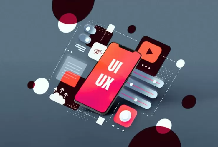
What Does “UI/UX That Converts” Actually Mean?
- UI (User Interface) = What users see (buttons, layout, typography, visuals)
- UX (User Experience) = How users feel while interacting (clarity, ease, flow, confidence)
A converting design does three things well:
- Builds trust immediately
- Reduces friction
- Guides users toward a clear action
At Empirical Edge Inc., we approach design strategically — aligning every visual element with business goals, not just aesthetics.
Because good design doesn’t just look professional.
It drives measurable results.
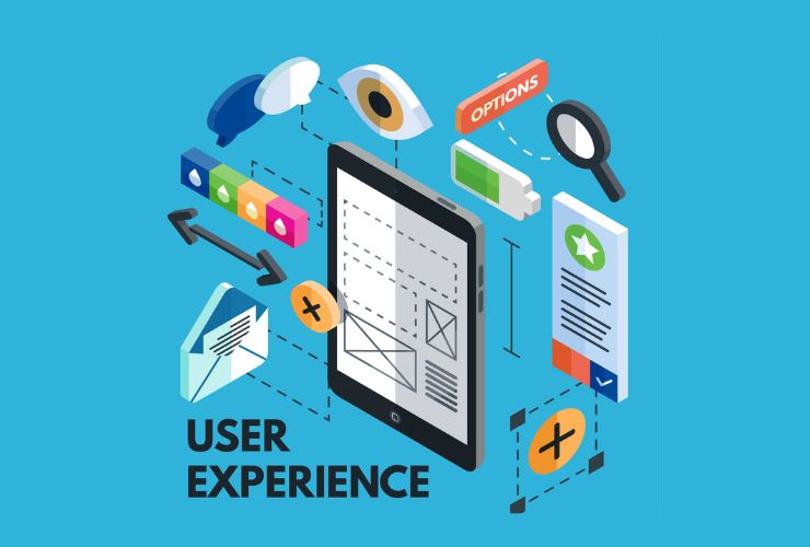
Why UI/UX Directly Impacts Revenue
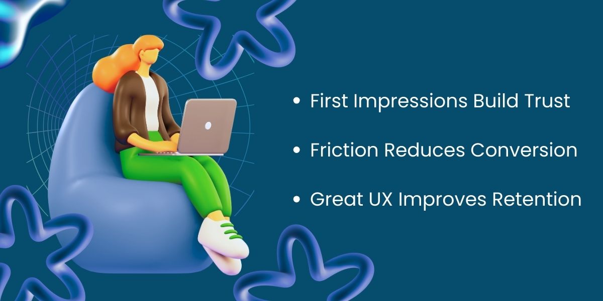
1. First Impressions Build Trust
Users judge credibility in seconds.
If your website:
- Feels cluttered
- Has inconsistent design
- Loads slowly
- Uses confusing navigation
They leave.
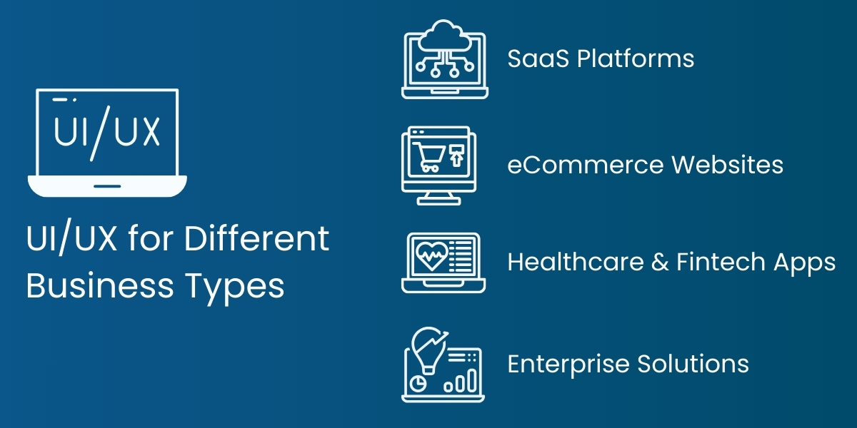
Clean layouts, logical structure, and consistent branding signal reliability and professionalism. In industries like SaaS, healthcare, fintech, or enterprise software, trust equals conversion.
2. Friction Reduces Conversion
Every extra click, form field, or unclear instruction reduces conversion rates.
For example:
- A long signup form decreases completions.
- Hidden pricing reduces demo requests.
- Complicated navigation increases bounce rate.
Conversion-focused UX simplifies the journey. It removes unnecessary decisions and makes the next step obvious.
3. Great UX Improves Retention
Getting a user is expensive. Keeping them is profitable.
When your product is intuitive:
- Users complete tasks faster.
- Support tickets decrease.
- Customer satisfaction increases.
- Retention improves.
Retention drives customer lifetime value — and that’s where real growth happens.
3 Core Principles of High-Converting UI/UX
You don’t need to be technical to understand these.
Principle 1: Clarity Over Creativity
Design trends change every year.
But clarity never goes out of style.
Ask:
- Can a first-time visitor understand what we do in 5 seconds?
- Is our main value proposition clear?
- Is our primary CTA obvious?
If users have to “figure it out,” you’ve already lost them.
Principle 2: One Clear Path Per Page
Too many options create decision fatigue.
A high-converting page should:
- Focus on one primary goal
- Have one dominant CTA
- Remove distractions
When everything is important, nothing is important.
Principle 3: Simplicity Builds Confidence
Simple does not mean boring.
Simple means:
- Clean layout
- Logical information hierarchy
- Easy-to-read fonts
- Clear button labels
- Predictable navigation
Simplicity reduces cognitive load — and users feel more confident completing actions like signing up or making payments.
The Cost of Ignoring UX
Many founders prioritize features over experience.
This leads to:
- Complex dashboards
- Confusing onboarding
- High drop-off rates
- Expensive redesigns later
Fixing poor UX after development is significantly more expensive than designing strategically from the start.
In the USA market especially, users expect speed, clarity, and seamless interaction. If your product doesn’t deliver that, competitors will.
Trust through Professional UX Strategy
At Empirical Edge Inc., we have developed our approach to UI and UX around 6 principles:
- Research Based Design
- User Journey Mapping
- Wireframing Pre Development
- Conversion Driven Layouts
- Mobile First/Responsive Design
- Performance Optimization
Our philosophy is to apply the methodology of Design Thinking, combined with the Business Strategy, to create a digital product that will not only look good, but that will also work effectively and efficiently at scale.
Our Simple Goal:
Design to Drive Business Growth.
The Competitive Advantage of Great UI/UX in the USA
The USA digital landscape is mature and highly competitive.
Customers expect:
- Fast-loading websites
- Seamless mobile experience
- Clear pricing
- Intuitive navigation
- Secure payment processes
Businesses that invest in conversion-driven design consistently outperform those that treat design as an afterthought.
UI/UX is no longer optional.
It’s a strategic growth driver.
Ready to Increase Conversions with Smarter Design?
Partner with Empirical Edge Inc. to build UI/UX that delivers measurable results in the USA market. From strategy to execution, we design digital experiences that turn visitors into loyal customers.
Frequently Asked Questions
UI refers to visual interface design, while UX focuses on overall user experience and ease of interaction.
Yes. Streamlined design and reduced friction directly improve conversion rates and customer retention.
It depends on complexity, but structured UX audits and redesigns typically take several weeks to months.
Minimal works best when it improves clarity and usability without removing essential functionality.
The USA market is competitive. Superior user experience differentiates brands and drives higher conversions.
Written by: Empirical Edge Team