


Mobile-first design is no longer a “nice to have” in today’s digital world; it has evolved into a necessary strategy for success. With over 60% of internet traffic coming from smartphone and tablet users, it is only natural that users expect access to streamlined, quick, intuitive experiences from the palm of their hands. A business that does not meet these expectations will lose credibility, traffic, and revenue.
Mobile-first design is the best practice for new startups building their first website and for brands looking to make necessary upgrades to their platform. When you start with the mobile experience, you are making the user – and their devices – the priority.
What does mobile-first design mean?
Mobile-first design is when a designer and developer approaches usability from the smallest screen and subsequently build upon that basic experience for progressively larger screens such as tablets, and desktop (referred to as progressive enhancement). Mobile-first design pushes designers to consider clarity, simplicity, and focus around the essential information – and fits every user regardless of how they access your site.
Instead of retrofitting the desktop (even though a well-designed site should never clutter a mobile interface) experience to fit mobile, you design with mobile priorities in mind from the beginning (quick load time, thumb/user-friendly navigation, responsive and adjustable content, uncomplicated UI).
Why is Mobile-First Design Important
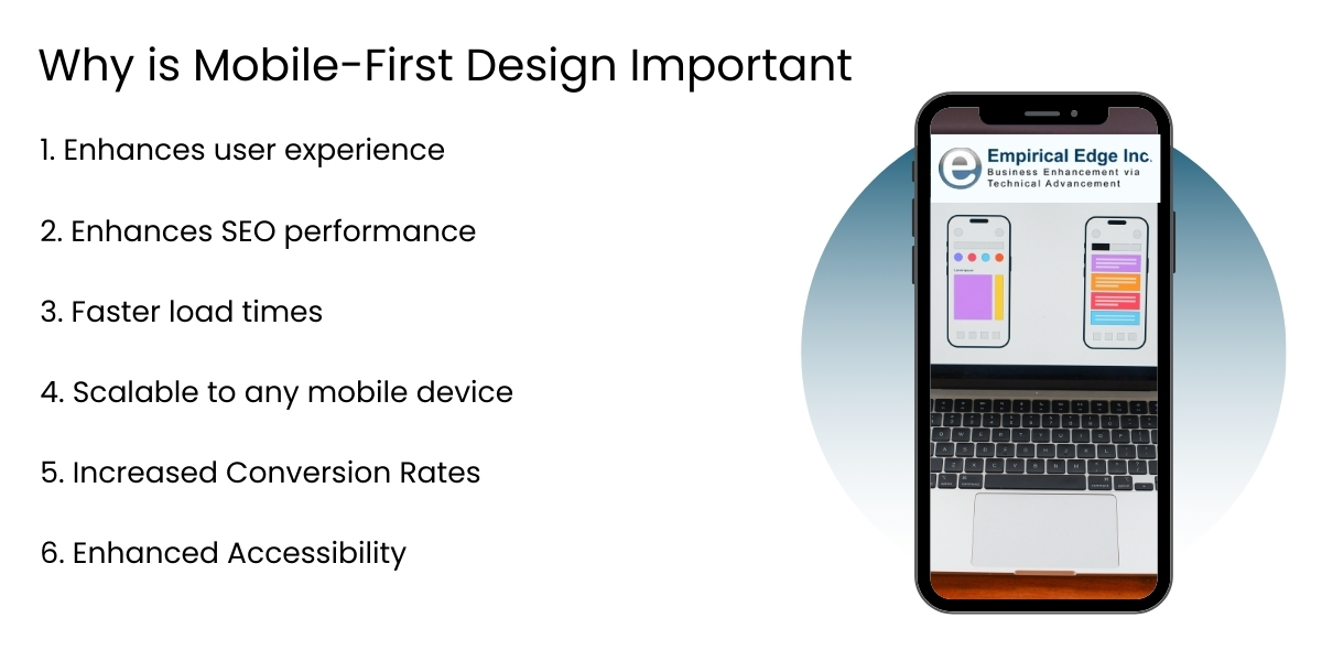
1. Enhances user experience
Mobile users are usually navigating while commuting, multitasking or in a hurry. Mobile-first design enables efficient navigation, simple user flows and quick user interactions. How does this improve user experience – by reducing distractions and prioritizing only the content that’s most relevant, we provide our users the satisfaction they want and reduce their frustration.
2. Enhances SEO performance
Since Google has moved to mobile-first indexing, how your site’s mobile version performs must be taken into account, as it drives your site search engine ranking. If your mobile experience is slow, cluttered or difficult to use, I can assure you your SEO will feel the pinch. A mobile website does not only tick the boxes in terms of Google’s requirements but enhance discoverability and organic traffic.
3. Faster load times
Mobile-first websites tend to be lighter and optimized for responsiveness. Clean code, minimal graphics and asynchronous loading will reduce page loading times, which is a must when considering most mobile users will exit any site that takes longer than 3 seconds to load. Faster load times can also lead to improved user experience and conversion rates.
4. Scalable to any mobile device
By designing from the smallest size up, you can ensure your site is adaptive / responsive to any device, smartphone, tablets, laptops or a wide screen monitor, and your layout looks and works the same. This ensures that you are future-proofing your digital presence.
5. Increased Conversion Rates
A properly optimized mobile experience reduces bounce rates and increases conversions. From increased simplicity in checkout processes in eCommerce to clear call-to-action on service pages, mobile-first UIs reduce friction for users the moment they start doing the action you want them to do.
6. Enhanced Accessibility
Designing with a mobile frame of mind helps improve accessibility. The increased touch targets, adjustable font sizes and simplified navigation schemes embrace not just mobile users but also users with disabilities or limitations making your web page more accessible and aligned with accessibility guidelines.
How Empirical Edge Helps You Go Mobile-First
At Empirical Edge, we specialize in mobile-first UI/UX design and responsive web development that ensures seamless performance across devices. Our experts develop experiences that are quick and easy to use built with user inputs and expectations in mind; all way from wireframe to deploy.
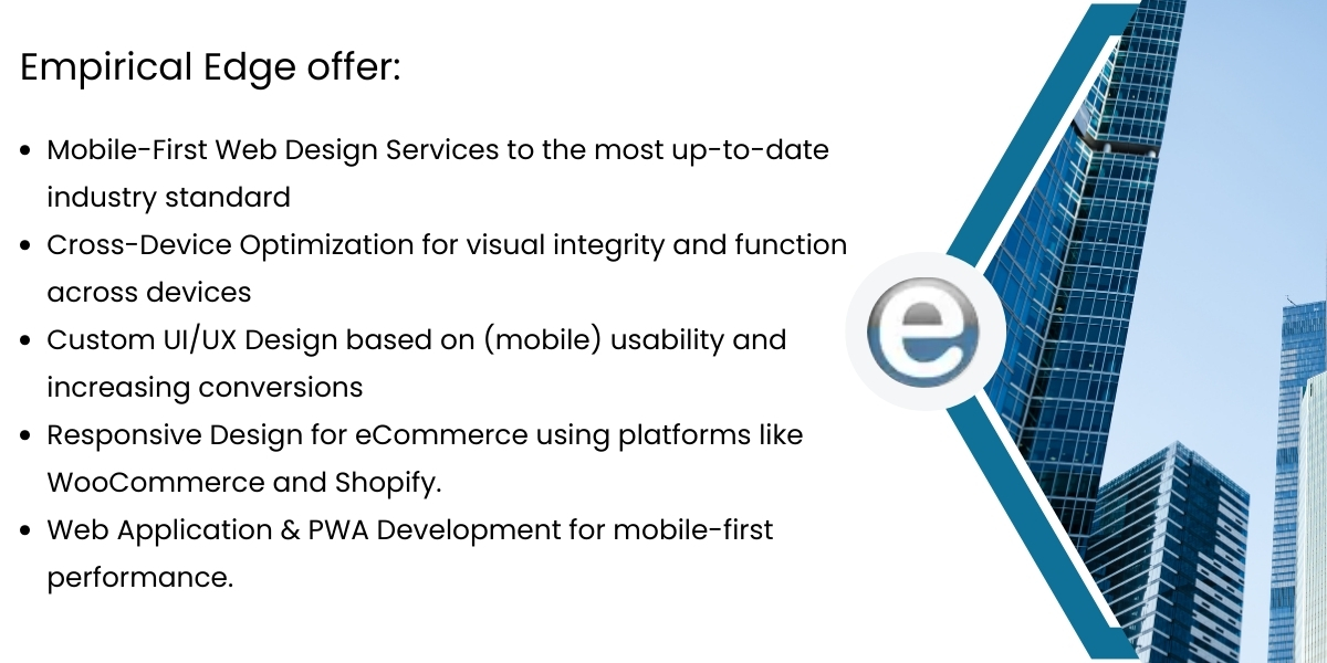
Empirical Edge makes sure that whether you are redesigning your corporate website, launching a product platform, or building a digital storefront, it is built for the mobile context.
Conclusion
Mobile-first design is more than just looks.
It’s a strategic, user-focused approach that delivers content how users want it—on their preferred device.
This method boosts SEO rankings, improves conversion rates, and increases overall user satisfaction.
Build a Mobile-First Website That Converts
We design fast, responsive, and mobile-first websites that improve user experience, SEO rankings, and conversions.
Frequently Asked Questions
Mobile-first design is a development approach where websites are designed for smartphones first and then expanded for tablets and desktops. This ensures better usability, faster performance, and improved responsiveness across all devices.
Mobile-first design is essential because most internet users access websites through mobile devices. A mobile-optimized website improves user experience, engagement, and business conversions.
Yes. Google uses mobile-first indexing, meaning the mobile version of a website is used for ranking and indexing. Mobile-friendly websites typically achieve better search visibility and organic traffic.
No. Mobile-first design starts with mobile screens and scales upward, while responsive design adapts layouts to different devices. Mobile-first design typically results in better performance and usability.
Written by: Empirical Edge Team


