


Color has a huge impact on the User Interface/User Experience (UI/UX) of any digital or non-digital product. Layout, typography, and interaction all help to build the framework for a digital product, but they do not dictate how users relate to that product; this is where colour comes in. Color helps to guide users’ focus, builds trust with users, and establishes a brand’s identity—these three aspects are foundational tenets of how to create a user experience that exceeds all expectations.
In a digital world that is entirely dependent upon design, including color, understanding the effects that color has on the user is not a nice to have, but rather an absolute necessity. This article will investigate how color theory impacts user experience and provide some suggestions for designers on how to use color theory(product naming) to enhance usability, engagement and user satisfaction.
Why Color is Important in User Interface/User Experience Design
Color is important for many reasons; however, the most important aspect of a good color design is to elicit emotion and influence perception, understanding, and decision-making. By utilizing colors in the correct manner, designers can:
- Increase Readability
- Build Recognition of Brand Identity
- Improve Conversions
- Help Direct User Actions
- Establish a Sense of Emotion
- Promote Accessibility and Inclusion
In addition, having a properly selected color scheme will enhance user retention and create a consistent visual representation across all screens and devices.
Understanding Color Theory in UX
Color Theory is the process that Designers use to understand how colors affect and interact with each other, as well as how they influence the psychology of a human being and how Designers will combine colors to create aesthetically pleasing and effective designs.
In relation to UX Design, the following components are important:
1. Hue – The Basic Color (i.e., Red, Blue, Green) Hue establishes Brand Recognition and Emotion.
2. Saturation – The Strength or Weakness of a Color; High Saturation is Dazzling, while Low Saturation creates a Sense of Calmness or Dullness.
3. Value(Brightness) – The Light or Dark of a Color; High Value will Create Openness, while Low Value Creates Depth.
By understanding these components of color theory, Designers can create a uses of Color Palettes that are Balanced and Meaningful.
The Role of Color Psychology in User Experience
Different colors trigger different emotions and reactions. Brands use these associations to shape user perception and trust.
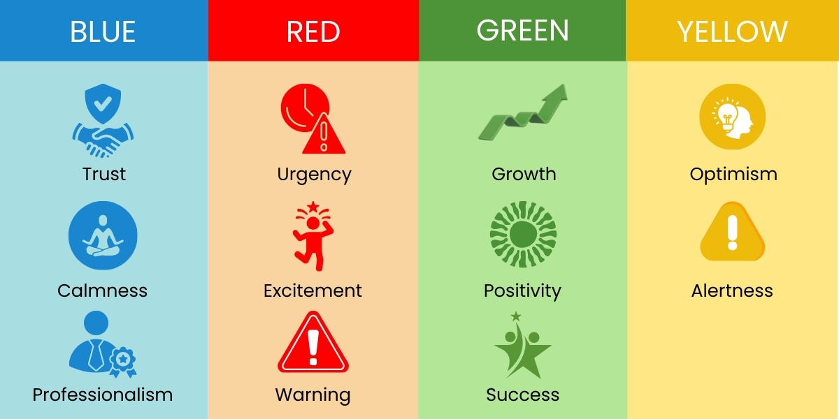
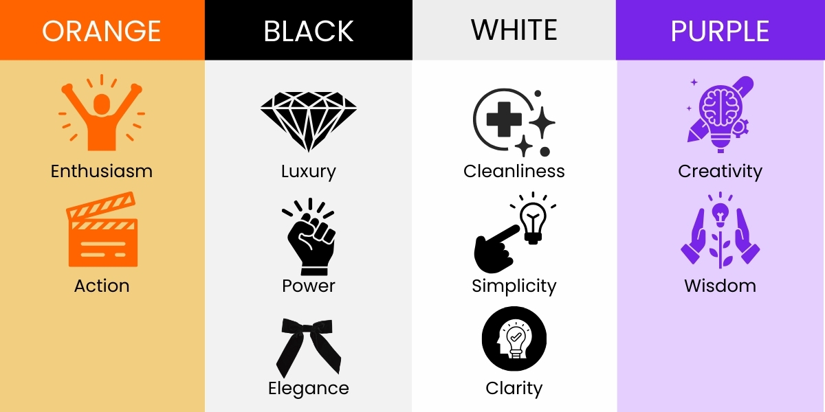
Common Color Associations in UI/UX
| Color | User Impact |
|---|---|
| Blue | Trust, calmness, professionalism |
| Red | Urgency, excitement, warning |
| Green | Growth, positivity, success |
| Yellow | Optimism, alertness |
| Orange | Enthusiasm, action |
| Black | Luxury, power, elegance |
| White | Cleanliness, simplicity, clarity |
| Purple | Creativity, wisdom |
For example:
- Banking apps use blue to build trust.
- E-commerce sites use red or orange for CTA buttons to prompt action.
- Health apps use green and white for calmness and clarity.
Color psychology directly shapes how users interact with and perceive a digital product.
The Role of Color in Creating a Strong Visual Hierarchy
Visual hierarchies help direct users to the most important parts of the site such as buttons, headlines, forms, and calls to action – colour is one of the best ways to achieve this goal.
How Color Can Affect a Visual Hierarchy
- Create contrast by using contrasting colors on Call to Action (CTA) buttons
- Differentiate between primary and secondary actions by color
- Make important content pop with color
- Group similar items with color
- Create focus through brightness/saturation
Example: A bright green “Sign Up” Button on a White Background is likely to draw attention due to the contrast and saturation of the two colors.
Creating Brand Recognition Through Color
Consistent use of color throughout your website/app and marketing helps users recognize and build a trusting relationship with your brand.
Benefits of Branding with Color:
- Creates Emotion
- Builds Consistency
- Improves Memorability
- Reinforces Brand Personality
- Identifies you Against Your Competition
Examples:
- Facebook uses the color blue to convey trust
- Netflix uses the color red to convey excitement
- Spotify uses the color green to convey creativity
The colors of your UI should support your brand values in order to create a complete User Experience.
UX and Color Accessibility
Color accessibility can no longer be an afterthought; it has to be considered during the design process of a user experience. The colors you select should work for all users regardless of visual impairments.
Color Accessibility Guidelines
- Use color combinations that provide adequate contrast for accessibility purposes (as stated in WCAG, the minimum acceptable ratio between body text and its background is 4.5:1).
- Never rely solely on color to associate something visually; rather, use icons, labels, or underline styles with all associated colors.
- Limit your palette of colors to the colors available to a user whose color blindness is most frequently diagnosed.
- Use colors for text against a coloured background that remain easy to read.
When you provide good color accessibility you allow all users to better experience the user interface than if you had not.
Color Influences on Conversions and User Behavior
The color of an element on your user experience directly influences how a user decides to interact with your design. Even small changes in color can create dramatic increases in clicks and conversion rates.
Some common color/behavior relationships are as follows:
- CTAs that are red or orange invoke urgency.
- Green is typically associated with “success” or “go”.
- Blue is associated with trust.
- Yellow is used for highlighting warnings or reminders.
- Luxury product purchases are associated with black.
When designing a user experience it is important to test many color combinations to discover what color resonates best with users.
Good Examples of Color Use in UI/UX
Minimalist Websites
When designing a website with a minimalistic approach, create your site primarily using black, white, and an accent color. The accent color should indicate actions the user should take, such as making a purchase.
Ecommerce Website
When selecting color for eCommerce, choose bright colors (red or orange) for CTA (call to action) buttons. The goal is to create an energy that will drive conversion.
Health/Welfare Apps
For Health & Welfare Apps, I recommend using green or blue to create a calm, reliable user experience.
Luxury Brands
Luxury Brands should use deep black, gold, or purple to suggest sophistication.
The above guidelines are based on research in color psychology and user expectations.
Conclusion
Utilizing color theory allows UI/UX designers to utilize one of the designer’s greatest strengths to develop emotional connection, help create identity for the brand, increase conversion, improve readability, and assist the user through their experience as a user.
Through an understanding of psychology, accessibility, and visual hierarchy, designers can develop digital experiences that have a genuine and meaningful user connection.
Mastering color theory is more than just finding beautiful colors; it’s about using color purposefully to elevate the entire user experience.
Frequently Asked Questions
Yes. Strategic color usage improves call-to-action visibility, brand recall, and navigation clarity, which can significantly increase sign-ups, purchases, and lead generation.
Yes. UX designers align color systems with brand guidelines while optimizing them for usability, emotional impact, and digital performance.
Absolutely. Proper color usage enhances navigation clarity, touch accuracy, dark mode usability, and emotional engagement across mobile devices.
Empirical Edge delivers user-centered UI/UX design using color psychology, accessibility standards, and data-driven testing to create visually powerful, conversion-focused digital experiences.
Written by: Empirical Edge Team