


In today’s world, for sites built with Zen Cart, a responsive eCommerce site is not optional, it is mandatory. A responsive site can substantially improve user engagement, conversion rates, and search rankings—meaning the performance of your Zen Cart store across all devices is key to your online business’ success.
Responsive store optimizations allow a Zen Cart store to fluidly adapt to different screen sizes — such as those on smartphones, tablets, or desktops — providing the shoppers consistent, intuitive shopping experiences. Even more, given the most recent statistics on eCommerce growth, more shoppers are browsing and purchasing mobile so responsiveness can have a direct impact on your bottom line.
Why Does Mobile Responsive Matter
More than half of any online shopping is done on mobile. If your Zen Cart store is not responsive, you risk losing valuable customers who expect smooth navigation, easy to load websites, and much more from their online purchases.
When a Zen Cart store is responsive it means it will load quickly, morph on an asymmetrical cycle, and create frictionless navigation all leading to the ultimate outcomes of higher satisfaction, increased engagements, and improve sales success.
Search engines like Google will recognize the value of a mobile responsive design, indexing the website accordingly for higher display in search results requiring added searches. Therefore, responsiveness is a success requirement for search engine optimization (SEO).
Benefits of a Zen Cart Store that is Responsive
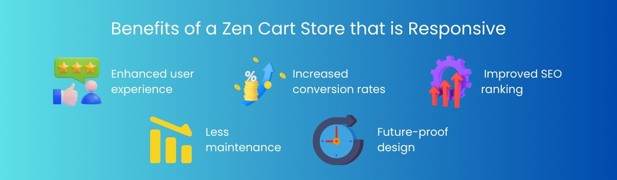
1. Enhanced user experience
Customers should be able to navigate, search, and purchase with ease, without the need to pinch, zoom, or horizontally scroll. Clear layouts and legible typography improve accessibility and comfort
2. Increased conversion rates
A clean mobile experience leads to better and quicker decisions and faster checkout processes, while reducing the incidence of cart abandonment, which improves conversion rates.
3. Improved SEO ranking
Google’s mobile-first indexing favors responsive websites, making it more likely that your Zen Cart store will rank higher and receive more organic traffic.
4. Less maintenance
It’s easier to manage a single responsive site than there to managed separate mobile and desktop versions. Updates and content changes will automatically disperse everywhere at once.
5. Future-proof design
With the constantly dropping new devices and new screen resolution, responsive Zen Cart stores guarantee compatibility and readjust automatically.
How to Create a Responsive Zen Cart Store
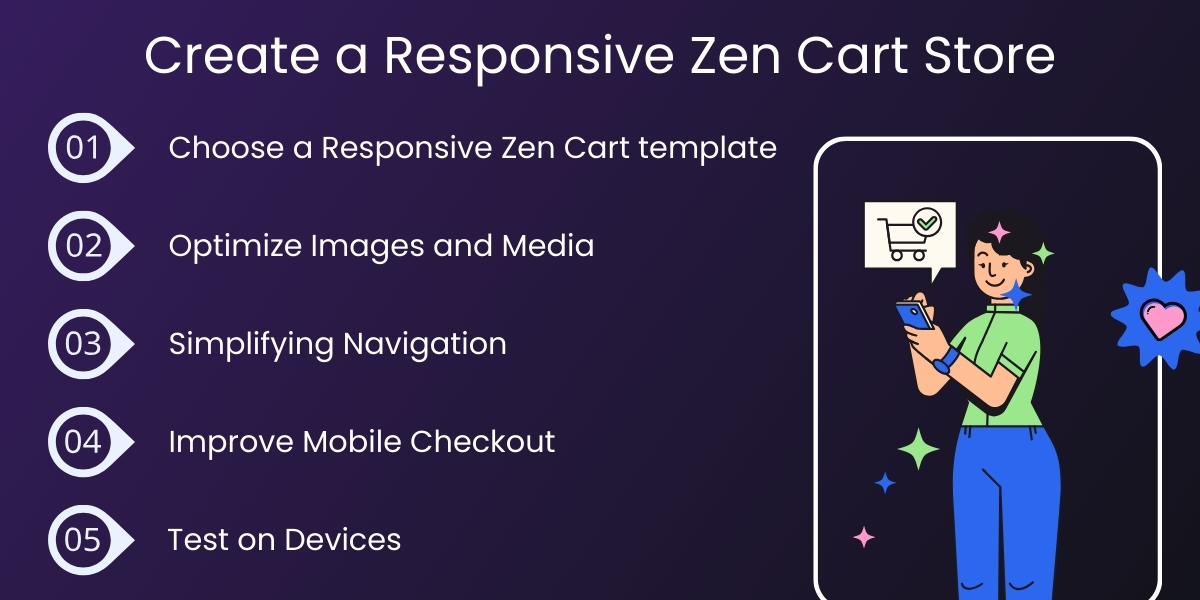
1. Choose a Responsive Zen Cart template
First, begin with a new Zen Cart template created with modern HTML5, CSS3, and Bootstrap. Responsive themes automatically adapt to different screen sizes and reduce the amount of needed CSS adjustments.
Pro tip: Choose themes that focus on aesthetics as well as PageSpeed. Well-established, fast, mobile-friendly themes will retain users and help them navigate to your e-commerce apps/widgets.
2. Optimize Images and Media
Images can significantly impact mobile performance, so use responsive images that are not oversized. Use compressed responsive images that can responsibly react to changes in screen size. To achieve this, you can utilize services like TinyPNG or ImageOptim to reduce file size without compromising quality.
Consider also enabling a lazy loading feature that only loads images that are off-screen when users scroll down the web page. It can help your page load faster, experience lower bounce rates, and provide a better user experience overall.
3. Simplifying Navigation
Simplicity is valued in the mobile experience. Consider replacing complex menus with more intuitive design, such as a hamburger menu or a collapsible category list. Make the navigation sticky or easily accessible, and use clear action-driven calls to action (CTAs) with messages like “Buy Now” or “Add to Cart.”
4. Improve Mobile Checkout
The checkout experience can make or break a sale. Simplifying the mobile checkout experience can benefit customers if you:
- Minimize the form fields
- Allow guest checkout
- Autofill shipping and payment details
- Incorporate mobile-first payment options such as Apple Pay, Google Pay, or PayPal
If the checkout experience is fast and secure, shoppers may be more confident and likely to convert.
5. Test on Devices
Before launching, perform extensive testing on your Zen Cart store on as many devices and browsers as possible to ensure its performance is consistent across all environments. You can use:
- Google’s Mobile-Friendly Test to evaluate responsiveness
- PageSpeed Insights to measure performance
- BrowserStack or LambdaTest, to test for cross-browser/device compatibility
Overall, device testing helps ensure that your Zen Cart store performs flawlessly across all user environments.
Recommendations for Developers
- Utilize Flexible Grids and Layouts: Design using CSS grids and percentage widths to enable natural re-sizing.
- Emphasize Readability: Employ appropriate text sizes, white space, and contrast that consumers will find easy to read on a mobile device.
- Touch-Friendly: Ensure any buttons and links are big enough to touch, and are spaced apart to relieve anxiety of accidental clicks.
- Refrain from Using Pop-ups: The annoyance of pop-ups and overlays introduced to entice consumers, is even worse on a mobile device. Additionally the SEO rankings may be negatively affected.
- Keep Zen Cart Current: Always use the latest version that ensures technology is up to date with improved security, performance and responsive function.
Additional Optimization Techniques
- Design with content delivery networks (CDNs) to provide faster speed globally.
- Minify any CSS, JS, and HTML to improve accessibility and loading speeds to pages.
- Use AMP (Accelerated Mobile Pages) for product pages to improve search visibility.
- Install schema markup since it usually improves visibility in searches and SEO.
Use Google Analytics 4 to track visitors, gather feedback, and track performance of specific areas needing improvement.
In Conclusion
You now have the foundational knowledge to create a responsive Zen Cart store that is vital to all successful modern eCommerce businesses. By focusing on mobile design, performance and navigation, you will create a shopping experience that will increase engagement and have a positive impact on sales.
Whether you’re a developer or a store owner, investing in responsiveness ensures your Zen Cart store remains competitive, scalable, and ready for the future of online shopping—no matter what device your customers use.
Written by: Empirical Edge Team


