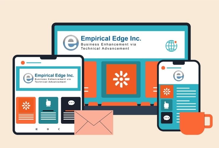


Over 50% of web traffic now comes from mobile devices. Providing a consistent experience across desktop, tablet, and phone is crucial. Without mobile optimization, companies risk losing users, conversions, and search visibility. Kentico Xperience offers tools to create responsive templates that adapt to any screen size. These templates enhance performance, usability, and engagement across all devices.
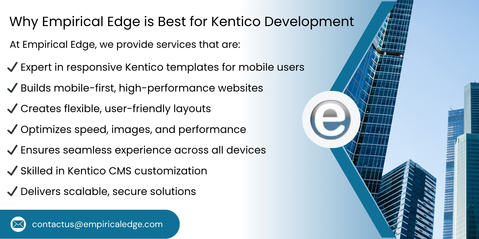
Responsive template design in Kentico is only partially about resizing work elements to fit on different screens. It is about thoughtful design, flexible layouts, optimized user interfaces, and efficiencies in development focused on performance. The ability to apply responsive design standards enables businesses to provide a consistent branding experience while also providing a user experience that builds improved satisfaction and, ultimately, conversions.
Why Responsive Templates Matter in Kentico
There are a few reasons why responsive templates are important for modern websites:
- Enhanced User Experience: User’s of mobile-friendly websites have high expectations for fast loading, easy-to-use homes, and readable content. With a responsive Kentico template, every device provides an enjoyable navigation experience and a well-organized layout.
- Greater Engagement: A mobile-friendly website means that visitors will be more likely to stay the website longer (increasing time on site), be more interactive (even consider a multi-device experience), and lessen the bounce rate.
- SEO Benefits: Mobile-optimized sites offer key SEO advantages, as Google (and other search engines) rewards responsiveness in mobile searches with higher rankings and visibility.
- Future-Ready Design: Responsive templates change with devices, screen sizes, resolutions, and formats to save expensive design time and revitalization down the road.
- Consistency of Branding: A responsive template allows you to consistently present the look and feel of your brand across all devices, which strengthens brand identity and trust.
Key Strategies for Building Responsive Kentico Templates
1. Mobile-First Strategy
In mobile-first strategy design a template from smallest screen sizes to the largest screen sizes and purposefully organize the content block layout. The template will contain the layout that prioritize the featured content and valuable pages first, and unnecessary blocks second. In Kentico’s layout engine you can do that, and prepare the templates to be responsive, and adapt the template correctly across multiple devices.
Example: Start with a simple and straightforward homepage layout that focuses on little more than keystone calls to action, expect the homepage content blocks to be added and modified as screen size increases.
2. Flexible Grid Layouts
Flexible grid frameworks play an important role in responsive design. By utilizing fluid grids, elements such as content, images, and modules will resize in proportion to the user’s device. In Kentico you can create grid-based layouts that maintain the “look and feel” regardless of the screen size.
Tip: Use grids with percentage-based dimensions for responsive behavior as opposed to fixed pixel measurements.
3. Adaptive Images and Media
Large images or media assets are one of the largest obstacles in mobile websites. Kentico has tools to help optimize media for varied devices. Use adaptive images rendering strategies which serve smaller, optimized images to smartphones and provide high-resolution images for desktops. Videos need to be responsive as well and size correctly within the container.
Best Practice: Use lazy loading on media content to improve user performance on slower connections.
4. Responsive Navigation
Users expect your navigation menu to be intuitive and touch-friendly on mobile. Kentico allows for dynamic menus to collapse in to hamburger menus, dropdowns or off canvas navigation for smaller screens. Always focus on making navigation easy to use, readable/affordable and usable across all devices.
Example: Use sticky menus that remain on the screen while protagonists navigate down a page to make it easier for users to see and use, especially on mobile.
5. Testing Across Devices
Continuous testing is important for responsive templates. Kentico’s preview features allow developers to test how each page renders in various devices, screen sizes, and browsers. Without consistent testing, there are no guarantees that layouts, media, and interactive components are running properly on all devices.
6. Performance Optimization
Responsive design should never sacrifice performance. There are many ways to optimize CSS and JavaScript: Minify and bundle files, leverage browser caching, and compress images to ensure optimal performance. Kentico supports a caching mechanism and is compatible with many performance tools that ensure web pages and template load quickly on both mobile and desktop devices.
Pro Tip: Keep your mobile templates light including heavy animations, excessive scripts, or anything that could slow down page rendering.
Additional Best Practices for Kentico Responsive Templates
1. CSS Media Queries
Consider using media queries to control your styling at specific screen widths to help your layout adapt to specific breakpoints.
2. Reusable Kentico Widgets
Build your templates using modular and reusable components to reduce the time it would take to build individual templates.
3. Content Prioritization
Prioritize content to ensure important is displayed first, especially for your mobile users.
4. Accessibility
Use ARIA labels, sufficient contrast, and ease of access to create and implement accessible and functioning templates for your audience.
5. Consistent Branding
Make sure the fonts, colors, and designs you implement will scale appropriately across devices.
6. Analytics Tracking
Utilize analytics to monitor users across devices to improve where possible, and optimize template performance.
Conclusion
Creating responsive Kentico templates is essential for delivering superior mobile experiences, improving engagement, boosting SEO performance, and future-proofing your website. By adopting a mobile-first design, implementing flexible grids, optimizing media, creating intuitive navigation, and ensuring robust performance, Kentico developers can create websites that look great and perform seamlessly across all devices.
Responsive templates not only enhance the user experience but also strengthen brand identity, increase conversions, and reduce maintenance costs over time. In today’s mobile-driven digital landscape, responsive design is a fundamental component of successful Kentico development.
Build Mobile-Ready Experiences with Kentico
Deliver seamless, high-performing websites across every device. Partner with experts to create responsive Kentico templates that enhance user experience, strengthen your brand, and drive measurable business results.
Frequently Asked Questions
Responsive Kentico templates are website layouts designed to automatically adapt to different screen sizes, ensuring a seamless browsing experience across desktops, tablets, and smartphones.
Responsive templates improve user experience, strengthen brand identity, increase conversions, and reduce maintenance costs by eliminating the need for multiple site versions.
Kentico provides mobile development features that allow pages to be easily viewed on various devices by creating layouts tailored to device profiles for optimal browsing with minimal scrolling and zooming.
Yes. Better usability and consistent branding typically lead to higher engagement and conversion rates while simplifying ongoing site management.
Yes. Maintaining a single responsive website is typically more efficient than managing separate desktop and mobile versions, lowering long-term maintenance effort.
Written by: Empirical Edge Team


