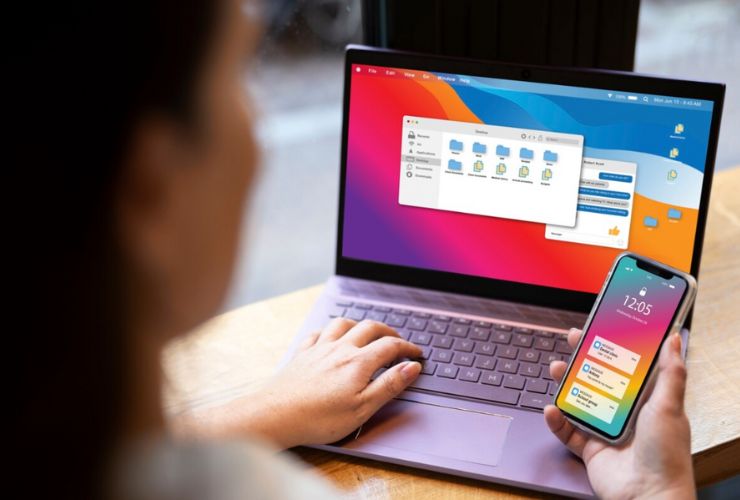


Kentico, a robust content management system (CMS), provides an out-of-the-box toolset and features that make it possible for businesses to develop websites that look not only amazing but also entirely optimized for mobile. From developing a simple site to a highly advanced digital experience, Kentico’s mobile responsiveness makes it possible for you to deliver improved performance, usability, and user satisfaction.
1. Responsive Design: Embrace Flexibility
Responsive design is one of the most fundamental pillars of having a successful mobile site. Design with responsiveness allows your site to dynamically change to a device’s screen orientation and resolution. Kentico has a rock-solid, native responsive foundation that allows your site to optimize for devices such as smartphones, tablets, and desktops.
Tip: Leverage Kentico’s responsive design features like flexible images, liquid grids, and modular content that adapt automatically according to the screen resolution. These are features that allow all devices to experience the same user experience. Moreover, make it a practice to always test the mobile responsiveness of your website using Google’s Mobile-Friendly Test or previewing options from Kentico in order to identify any issues at a later time.
Bonus Tip: Don’t omit font sizes and touch targets of buttons. Ensure text is readable and buttons can be tapped comfortably on smaller devices. This simple adjustment greatly improves user experience.
2. Enhance Mobile Site Speed
Site speed is another key area of concern for mobile site functionality. Mobile users want pages to load fast, and slow speeds can raise the bounce rate in addition to providing a bad user experience. Kentico provides several features to optimize your mobile site’s speed, such as caching, image compression, and content delivery networks (CDNs).
Tip: Leverage the caching functionality provided by Kentico to store frequently called dynamic content and reduce page loads and server load. Even compress images and turn on lazy loading, where content gets loaded only when the user actually displays it. It improves mobile user experience as well as page loads.
Advanced Tip: Let Kentico automatically optimize images by rescaling them according to the user’s screen resolution, thereby loading them quickly without loss of quality. This is important for mobile users with slower networks.
3. Navigation That Works on Mobile Devices
Navigation is a critical component of any site, and on a mobile device, less is best. Very complex and layered navigation models will simply confuse and become an issue for the user. Kentico has a number of tools to deploy simple, mobile-centric navigation items such as collapsible menus, fixed navigation bars, and mobile layout menu types.
Tip: Implement a hamburger menu or sticky header that facilitates mobile navigation. Kentico navigation widgets, included with the platform, allow you to build user-friendly menus on mobile devices without sacrificing usability across platforms.
Pro Tip: Organize your content into clearly defined categories, and provide the most critical links at hand. Mobile users will engage with websites at a quicker rate, so providing an easily accessible, streamlined menu is essential.
4. Touch-Friendly Interface
Whereas desktop users click through websites, mobile users touch websites. Which means that the things on your site—buttons, links, forms—need to be touch-friendly. Kentico makes it easy for you to create touch-enhanced items so that you can make better use of your mobile site.
Tip: Make all tapable elements (e.g., buttons and links) tapable on even smaller screens by making them a reasonable size for easy tapping. Kentico content management features help you optimize touch events in such a way that every interaction is intuitive and seamless.
Bonus Tip: Place interactive items far enough apart that accidental touches won’t occur. Avoid stacking buttons together too tightly, since this can infuriate mobile visitors attempting to access your site.
5. Optimize for Mobile Users
There is less screen real estate on cell phones, and too much information presented will overwhelm. Optimize your most critical content for your mobile audience and deliver short, valuable chunks of information. Kentico allows you to dictate the delivery of content based on the device, so cell phone users see content optimized for small screens.
Tip: Use Kentico’s content targeting functionality to target mobile users with content. Display the most critical information such as offers, promotions, or CTAs upfront and prominently, and consider displaying shortened text or abbreviated versions of lengthy content to mobile users.
Advanced Tip: Employ modular content that can be easily rearranged or concealed by device. This will allow your mobile site to show only the most essential content without overwhelming the user.
6. Mobile Device Forms
Forms are a basic component of websites, but long and complex forms are difficult to fill out on mobile phones. Kentico provides solutions that can help in developing user-friendly and completely optimized mobile device forms.
Tip: Keep your forms short and user-friendly. Use Kentico’s form builder to design simple, mobile-optimized forms that allow users to easily complete them on their devices. Consider using multi-step forms to break down complex forms into manageable sections.
Bonus Tip: Use auto-fill options wherever possible to reduce the amount of typing required. Mobile users appreciate any feature that makes their experience faster and easier.
7. Leverage AMP (Accelerated Mobile Pages)
AMP (Accelerated Mobile Pages) is a framework built to speed up mobile web pages. AMP pages are light, and they are much faster than regular pages. If you have to develop super-fast, content-heavy pages like blogs or news portals, integrating AMP on your Kentico website can be a game-changer.
Tip: Integration with AMP enables Kentico to enable you with lightning-fast mobile pages, leading to frustration-free and enjoyable user experience. AMP works best in content websites where page speed is important.
Advanced Tip: AMP not just accelerates, but also offers better SEO rankings as Google prefers mobile-friendly and fast-loading content. In case you are posting a great deal of content or a blog, think of AMP as a feature of your mobile plan.
8. Test on Multiple Devices
Before you roll out your mobile website, you should test it on various devices and screens to achieve balance and usability. Kentico provides preview tools by which you can gauge the look of your site on various devices, but it also helps in testing the same using real devices.
Tip: Regularly test your mobile site across various devices and browsers to ensure they are compatible. Kentico preview tools allow you to see how your site will look on different devices, but it is best to test on actual devices in order to have a better approximation of the user experience.
Advanced Tip: Test on many browsers and devices using services like BrowserStack to ensure your site works great on all platforms. Testing ensures that you’re catching potential issues before your users do.
Conclusion:
Mobile-first world means that your website should be mobile-friendly in order to provide a smooth, friendly experience. With Kentico’s adaptable tools and features, it has never been easier to create a mobile-optimized website. By utilizing these best practices—responsive design, fast load time, mobile navigation, touch interface, etc.—you can create a mobile site that is not just gorgeous but is also a delight to use. Giving an exceptional mobile experience equates to increased engagement, greater user satisfaction, and improved conversion rates.
Written by: Empirical Edge Team


