


Creating responsive, intuitive, and beautiful user interfaces is at the heart of web development today. With the increasing complexity of web applications, front-end developers require robust tools to provide consistency, usability, and scalability. Angular Material provides a component-based UI system that enables developers to create high-quality apps following Google’s Material Design guidelines.
This blog will discuss the benefits, functionality, and best practice of Angular Material. From creating a tidy dashboard to building an easy form, Angular Material provides the infrastructure for smooth and elegant user interactions.
What Is Angular Material?
Angular Material is a UI component library created by the Angular team. Angular Material employs Google’s Material Design system in Angular applications, providing a shared and flexible language of design. They are able to apply pre-styled components like buttons, dialogs, form fields, and nav elements without needing to replicate them themselves.
The library aims at:
- Clean looks
- Responsive behavior
- Accessibility
- Custom theming
Whether it’s a small web app or an entire enterprise platform, Angular Material makes UI development easy without sacrificing performance or design.
Why Angular Material?
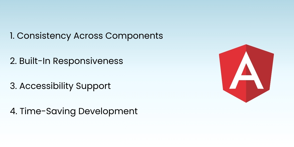
1. Consistency Across Components
Angular Material provides consistent design throughout your whole application. Every component follows Material Design guidelines, which guarantees spacing, typography, animation, and behavior are consistent.
2. Built-In Responsiveness
Components are crafted to be great-looking and great-feeling on a variety of screen sizes. This makes it easy for your app to be easy to use on mobile, tablet, and desktop devices.
3. Accessibility Support
Accessibility is a natural part of any contemporary UI. Angular Material components are ARIA attribute supported and keyboard navigable, and therefore usable by anyone, including users of assistive technology.
4. Time-Saving Development
Pre-defined components save you the time of defining components from scratch. Angular Material helps to add functionality with no hassle and focus more on application logic and less on styling and layout.
Core Angular Material Components
Angular Material has a comprehensive set of UI components tailored specifically for web applications. Some of the most renowned and widely used categories are provided below:
Buttons and Indicators
Material buttons are ubiquitous and come in numerous flavors like raised, flat, and icon buttons. Progress bars and spinners allow you to convey loading states to users with great effect.
Form Controls
The form theme is user interaction. Angular Material has text fields, dropdowns, sliders, date pickers, and other input elements. It provides native form validation support and dynamic error messages with a greater UX.
Layout Elements
For layout designing, Material components such as grid lists, cards, dividers, and expansion panels provide well-structured and clean layouts.
Navigation Tools
Navigation tools such as side navs (side navigation menus), toolbars, tabs, and menus make it possible for users to navigate your app naturally. They are themeable and responsive.
Dialogs and Popups
Dialogs, snack bars, and tooltips are utilized for displaying user prompts, warnings, and tool-driven suggestions. Light UI elements are simple to animate and simple to use.
Theming with Angular Material
The theming system in Angular Material is one of the finest features. You either utilize pre-built themes or create custom themes as per your brand. An Angular Material theme specifies colors for primary, accent, warn, and background properties.
You can:
- Define dark or light mode themes
- Define typography settings
- Override component classes
- Enforce consistent theming in your app
Theming makes the UI beautiful and gives you a branded experience on any device.
Responsive Design with Angular Material
Angular Material components are responsive by default, but combining the components with layout libraries such as Angular Flex Layout provides you with more control over what happens when elements resize screens.
With Angular Material, you can:
- Align content in flex containers
- Build responsive UI grids
- Employ screen-based styling with breakpoints
- Optimize mobile-first layout
This allows developers to build apps that deliver the same user experience across desktops, tablets, and smartphones.
Accessibility Considerations
Accessibility is not an option—it’s required. Angular Material facilitates inclusive design by providing components that are:
- Keyboard navigable
- Screen reader accessible
- RIA attribute labeled
With Angular Material, you can make your application accessibility compliant and accessible to all.
Best Practices in Deploying Angular Material
To get the most out of Angular Material, practice the following best practices:
- Import only what you must to keep bundle size small.
- Utilize custom themes for branding consistency.
- Benefit from responsive layout approaches from the start.
- Utilize with Angular Reactive Forms to provide scalable form handling.
- Test component accessibility on a regular basis.
- Stay up to date with Angular Material documentation and release notes.
- These practices keep your project responsive and scalable as it grows.
Real-World Use Cases
Here are some scenarios where Angular Material is particularly suitable:
- Admin Dashboards: Speed up data tables, nav menus, and widgets with Material components in no time.
- E-commerce Platforms: Create professional-looking product lists, filtering systems, and checkout forms with good performance.
- User Registration Flows: Create multi-step forms with valid inputs, validation errors, and visual hints.
- Mobile-Responsive Apps: Give mobile web apps native-like performance of Material design principles.
Problems and Deliberations
While Angular Material offers a lot of worth, caution must be exercised regarding:
- Bundle Size: Bringing in the entire library unnecessarily bloats files. Careful imports are optimal.
- Learning Curve: There will be some initial investment in learning Material Design principles for new devs.
- Restrictions on Customization: Highly complex UI designs can require additional styling beyond that offered by Angular Material out of the box.
These are simple to prevent through foresight, and the long-term benefits usually justify the time to learn it in the first place.
Conclusion
Angular Material provides you with everything you need to design responsive, clean, and modern user interfaces in your Angular applications. It simplifies development, enhances consistency, and solves accessibility—paying only the cost of reduced development time.
With Angular Material’s robust set of components, theming support, and responsive support, you can take your UI design to a professional level. You are missing out on using essential front-end development productivity tools if you are an Angular newbie or building enterprise applications and are not using Angular Material.
Ready to build stunning, responsive user interfaces faster?
At Empirical Edge, our experts use Angular Material to create beautifully designed, performance-optimized UI components that elevate your application and enhance user engagement.
Frequently Asked Questions
Angular Material is a UI component library for Angular that provides pre-built, responsive, and accessible UI elements based on Google’s Material Design system.
It ensures consistent design, built-in responsiveness, accessibility support, and pre-styled components — saving time and improving user experience.
Common components include buttons, form controls, navigation tools, dialogs, cards, progress indicators, and layout elements.
Yes — Angular Material supports custom theming (colors, typography, dark/light modes) to match your brand’s style.
Some developers note that the library can increase bundle size if over-imported, and highly unique UI designs may require additional custom styling.
Written by: Empirical Edge Team


